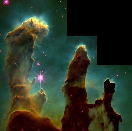
Hubble’s iconic 1995 “Pillars of Creation” image
In part 2 of this blog mini-series on narrowband imaging we saw how the iconic Hubble image of the “pillars of creation” gave birth to the so-called “Hubble palette” mapping the sulphur, hydrogen and oxygen narrow band filters to red, green and blue respectively. The rationale for this approach was set forth by the Space Telescope Science Institute in their Astrophysical Journal article of 2005:
“An example of an image produced using the chromatic ordering scheme is the Hester &
Scowen (1995) HST image of M16. The data (Hester & Scowen 1995) were obtained with
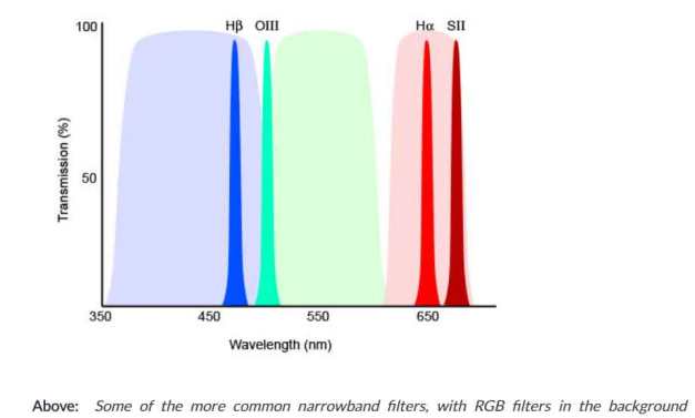
the HST WFPC2 camera with the F502N ([OIII] _5012_A), F656N (Halpha _6564_A) and F673N ([SII] _6732_A) narrowband filters. To generate the image, the three datasets were colorized blue, green and red respectively. Filter F502N was assigned blue because it has the shortest wavelength passband,filter F673N was assigned red because it has the longest wavelength passband, and filter F656N was assigned green because its passband is of intermediate wave-length compared to the other two. The chromatic ordering for the HST M16 image is not a natural color scheme because the filters were not assigned their visible colors. That is, when viewed against a bright, white light, the F502N filter appears to be green, not blue, to the human eye. Similarly, the F656N filter looks a deep red, not green. Only the F673N filter is assigned its perceived color, red. It is also not a natural color scheme because it uses narrow-band filters that pass only a very small fraction of the visible spectrum. Furthermore, rather than photometrically calibrating the projected images they are balanced so that the H-alpha data doesn’t dominate and turn the image completely green. In comparison, a natural color image of M16 (Shoening 1973) shows the nebula as deep red, again because of the strong H_alpha emission from the nebula. The color assignment chosen is an extreme version of the hue contrast. The image is also an example of a split complementary color scheme. The blue (from the [OIII]filter) and the green (from the H_ alpha filter) combine to generate a background of greenish-cyan, whose complement is a slightly-red orange. Areas of the pillars are yellow-orange and orange-red which are on either side of this orange on the color wheel, hence the complement is split.
Also the RGB assignment to each layer, along with the intensity stretches, ensured that
the combined datasets produced cyan, magenta and yellow, resulting in a strong contrast
of hue in the undiluted primaries of the subtractive system. Where the intensity of [OIII]
(blue) and H_ (green) are balanced, cyan appears in the background. The H_ (green) and
[SII] (red) images combine to produce yellow along the edge of the pillars. And, while the
center of the stars are white due to the equal combination of RGB, their halos are magenta because the F673N filter broadens the point-spread function. Itten (1990), in his section on this contrast of hue states, the undiluted primaries and secondaries always have a character of aboriginal cosmic splendor as well as of concrete actuality,” a statement that applies to the HST image of M16. The two supporting contrasts, (split) complementary and light-dark further boost this image’s appeal.”
Today I demonstrate my experience with this in a recent image I took of the Lagoon Nebula- Trifid Nebula complex. This is a popular region amongst astroimagers as it encompasses the dense star fields of the southern portion of the Milky Way band, toward the center of the galaxy.
Three starless images from the top left: H-alpha, SII, OIII open in the Pixinsight processing program and on the right side showing the assignment of the Ha, SII, OIII channels to red, green and blue respectively. This happens after the step shown below.
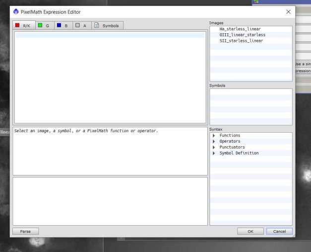
In Pixinsight you simply double click on the image file name in the list at the right and it will appear under the color tab you intend to match it to. In this example we have the red tab open at the left and we will click on the SII image file in the list shown. Then you click on the green tab at the top left, enter the Ha file and do the same for blue and OIII. Click ok and you go back to the main screen above where you apply the settings to arrive at your color image. And that’s it!
Today’s image processing software allows for an infinite number of options for combining the H-alpha, SII and OIII channels. In the example above I have three starless versions of the nebula in each of the channels. In most programs all you do is enter the image file in the appropriate field depending on how you wish to do the r-g-b combination.
Again, the recommendation put forth by the Hubble Heritage team is to assign sulphur, hydrogen, oxygen to r-g-b respectively. However since it is false color as we discussed in the last post and also pointed out in the article above, there is no law prohibiting experimentation!
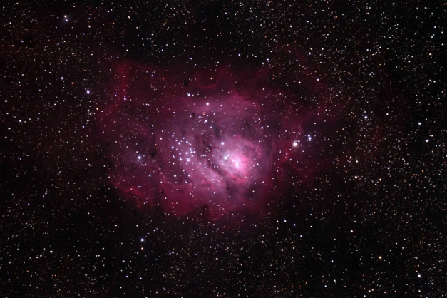
Here is a typical broadband image of the Lagoon Nebula. Notice the dominant pink color. This is what we amateurs have pretty much permanently stamped in our minds of how the colors “should” look

In this example H-alpha is assigned red, OIII to green and SII to blue. This is a common practice interestingly for the Canada-France-Hawaii team at the Keck observatory on Mauna Kea, Hawaii
In this example above an H-O-S assignment was given and the result is quite pink but the idea here is to try and represent the nebulae in more of a “natural” color scheme as you would see for a typical broadband image
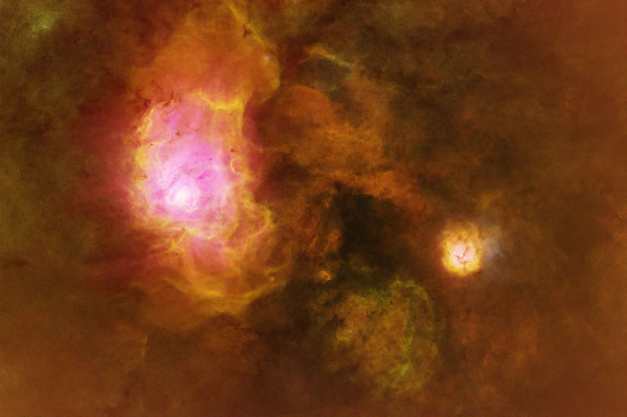
HSO palette assigning H-alpha to red, SII to green, OIII to blue. This was my idea to try and get the color closer to what you would see with a broadband image
This was something I tried which was an “HSO” palette. At first I really liked this because the Lagoon nebula is pink and that is what it typically looks like in broadband but after further processing I could not wrap my head around around a white Trifid nebula which is the smaller object to the right.
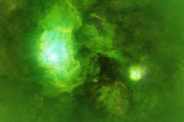
The “official” Hubble palette. S-H-O
So here it is folks! The official “Hubble palette”. This looked absolutely awful when I first saw it. I think the problem most of us have when we first get into this is the dominant green color which is very difficult to wrap your head around! It is important to note that for amateur data, the Hydrogen alpha channel is by far the strongest and when you assign this to green, the green will totally overwhelm everything. However this can be corrected with the processing software so you can dial the green down as much as you like.
After experimenting with the different combinations, I decided first off that the Trifid nebula portion of the image was not going to work at all. My choices were white or yellow. If you do this long enough you are so used to seeing objects a certain way that the false color just cannot work with certain targets. So I cropped that section out. I put aside my prejudices regarding green and followed the Hubble palette “doctrine” to arrive at the final solution shown here:
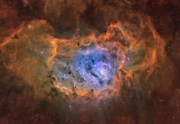
This is my version of the Lagoon Nebula in narrow band using the Hubble palette principles. The sulfur data was mapped to red, h-alpha to green and oxygen to blue. All of the colors are there. I obviously dialed down the green quite a bit but there is still green in there and the complementary colors are correct according to the article. I think it will take some time to get a “feel” for this approach in terms of what is presentable and what isn’t. I think the take home point is that if you are doing narrowband imaging and wish to present your results, best bet is to follow the directions set forth in the article discussed above and use the Hubble palette of S-H-O, rather than trying to make the image “look” like a broadband image which it can never be!
Thanks for reading!
DrDave